Minecraft’s Latest Update Sparks Player Outrage
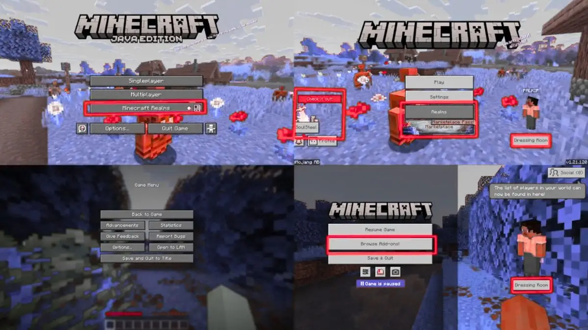
The Minecraft Bedrock Edition community is once again furious — and this time, the backlash looks serious. With the 1.21.120 update, Microsoft and Mojang have introduced a new pause menu redesign that’s left players angry, confused, and questioning whether the developers actually play their own game.
The reason? The new “Browse Add-ons!” button has taken over the most valuable spot on the menu — where the Settings button used to be.
A Button That Broke the Community
Players aren’t upset over minor visuals or color changes. The problem runs deeper: the Settings menu, a feature players access constantly to tweak controls, adjust audio, or fix visuals, has now been pushed aside to a tiny gear icon.
In its place sits a large, attention-grabbing “Browse Add-ons!” button, complete with an exclamation mark. This isn’t just a small design tweak — it’s an obvious push toward the Minecraft Marketplace, encouraging players to spend real money on add-ons and skins.
Within just two days of the update, a Reddit thread about the change racked up over 5,700 upvotes. Players called the move “sheer stupidity,” “greedy,” and “offensive.”
As one top comment bluntly put it:
“Why is an add-on store more accessible than basic settings? It’s not bad design — it’s pure greed.”
Bad Design or Monetization Strategy?
The frustration doesn’t stop there. Players point out that the Marketplace button doesn’t even lead to your active Realms — the paid servers many Bedrock users subscribe to monthly.
Instead, the giant purple button redirects to the add-on storefront, forcing users to go through multiple clicks just to reach their Realms. It’s a classic case of poor UX design, wrapped up in aggressive monetization tactics.
One long-time player described the change as “the final straw,” saying they’re quitting Bedrock entirely after years of performance issues and design frustrations.
How Minecraft Got Here
This isn’t the first time the Bedrock edition’s interface has drawn criticism. Over the years, Mojang has gradually added monetization buttons and marketplace links into the game’s core menus.
But for many players, this is the first time those design choices have directly interfered with basic gameplay functions.
A Reddit user even shared a visual timeline showing how the pause menu evolved from simple and clean to cluttered and commercialized, calling the new design “a billboard disguised as a menu.”
Java Players Watch with Relief
Over in the Java Edition community, reactions have been a mix of sympathy and smug relief.
“If this happened in Java, there’d be a mod to fix it within an hour,” one user joked — and they’re not wrong. The Java version allows modders to revert unwanted UI changes, giving players far more control over their experience.
Bedrock players, however, don’t have that luxury. Because the version is tied to Microsoft’s ecosystem, changes like these are hardcoded and mandatory.
Community Response: DIY Fixes & Frustration
Some clever players have already found temporary workarounds. A few texture packs that swap button placements are circulating online, offering a partial fix. But since much of the new menu is locked within the game’s code, complete reversal isn’t possible.
Still, many say the damage is already done. Between poor performance, missing features, and forced monetization, this latest UI overhaul has become the final breaking point for a portion of the community.
One frustrated player summed it up perfectly:
“I just want to play Minecraft — not browse a store every time I pause the game.”
Will Mojang Listen This Time?
Whether Mojang will respond to the feedback remains uncertain. Historically, the company has been slow to reverse unpopular UI changes, even after community outcry.
Yet, the scale of the backlash this time might be hard to ignore. Across Reddit, X (formerly Twitter), and Discord, thousands of Bedrock fans are demanding that the pause menu be restored to its original layout — without the intrusive marketplace promotion.
As discussions continue to grow, players are hoping the company takes the hint and reverts the change in the next update.
Final Thoughts: A Pause Menu That Crossed the Line
Minecraft Bedrock’s new 1.21.120 pause menu was meant to be a quality-of-life update. Instead, it’s become a symbol of everything players fear about Microsoft’s influence on the game.
The frustration isn’t just about one button — it’s about what it represents: a beloved sandbox game slowly turning into a microtransaction marketplace.
Unless Mojang rethinks its priorities, Bedrock players might keep asking the same question — is Minecraft still about creativity, or just about cash?